Scroll study
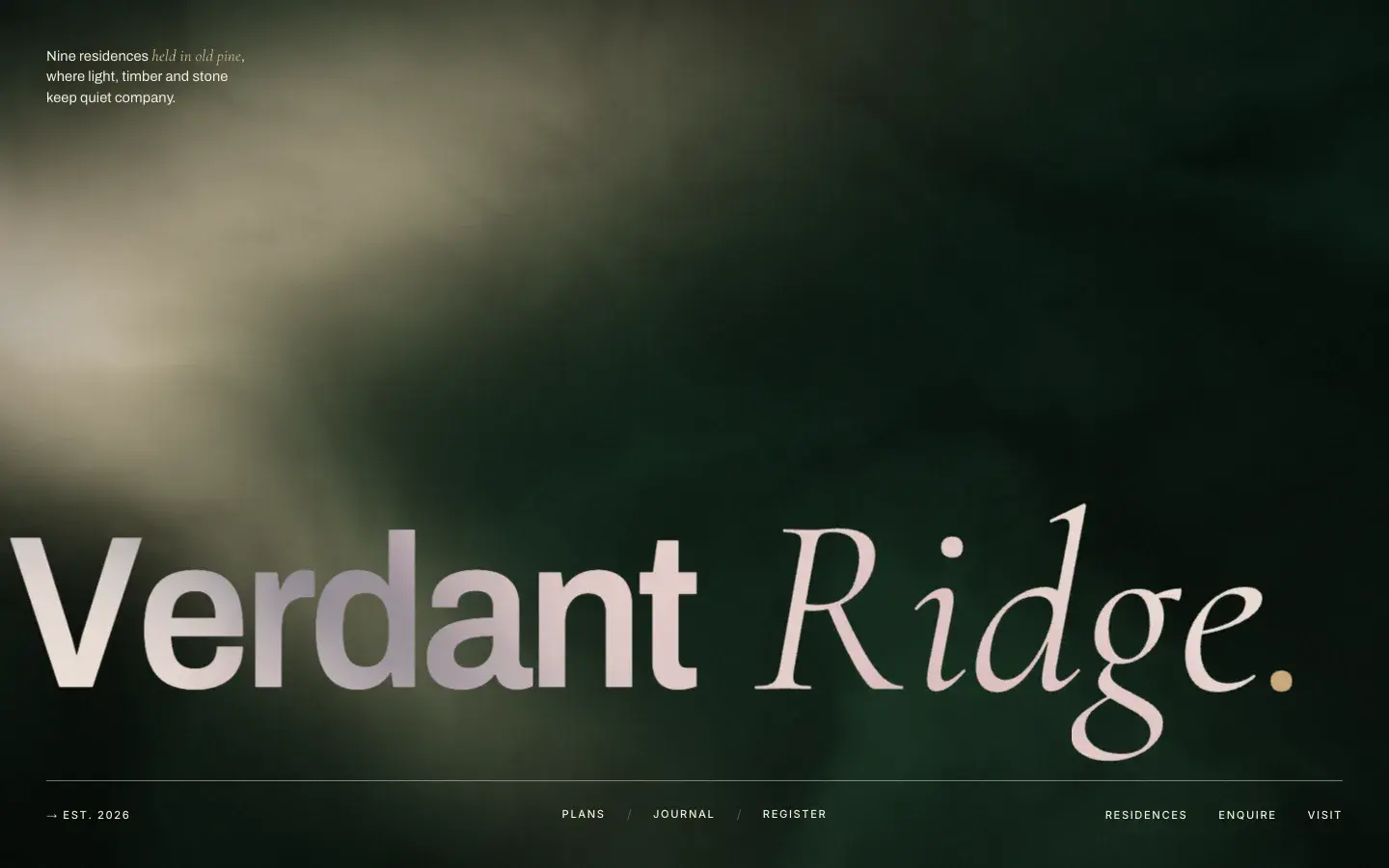
Verdant Ridge
I wanted to know whether a property site could hold its nerve. Most of them shout. This one is nine timber-and-stone houses in a pine forest, sold by a studio that doesn't exist, and the whole page is built on the idea that restraint sells better than spectacle.
It is also the most mechanically involved thing here: a walkthrough scrubbed frame by frame off the scrollbar, and a gold thread that draws itself down the page at exactly the rate you read.
- Type
- Scroll study
- Year
- 2026
- Stack
- GSAP, ScrollTrigger, Lenis, Canvas
Origin
This one owes a clear debt to Luke Baffait's site. The wordmark that splits itself apart on load, the nav where every character flips through letters before it settles, and the deadpan line that undercuts all the careful language around it — his is “Basically, I make websites”, mine is “Basically, it’s a house in the woods”.
What I wanted to find out was whether that register survives being pointed at something other than a personal site. Turns out a property brochure is exactly the right place for it: the restraint reads as expensive, and the one joke keeps it from being insufferable.
The walkthrough is 200 JPEGs, not a video
A video seems like the obvious choice and is the wrong one. It cannot be scrubbed frame-accurately on iOS, and under a scrub tween it stutters badly everywhere else — you drag, and the picture arrives late and in the wrong place.
So the walkthrough is a folder of stills drawn onto a canvas, and the scroll position picks the frame. Cover-fit is done by hand on each draw so the frame fills any viewport, and the device pixel ratio is capped at 1.5 — past that you are paying for pixels nobody can see.
function draw(i) {
  if (i === drawn || i < 0 || i >= TOTAL) return;
  const img = frames[i];
  if (!img || !img.naturalWidth) return;

  const cw = canvas.width, ch = canvas.height;
  const s = Math.max(cw / img.naturalWidth, ch / img.naturalHeight);
  const dw = img.naturalWidth * s, dh = img.naturalHeight * s;

  ctx.clearRect(0, 0, cw, ch);
  ctx.drawImage(img, (cw - dw) * 0.5, (ch - dh) * 0.5, dw, dh);
  drawn = i;
}It plays before it has finished loading
Two hundred frames is a lot to wait for, and a black rectangle is a bad first impression. Frame one loads on its own and the canvas is live immediately. The rest fan out over a small pool behind it.
The scrub never reads the frame it wants — it reads the nearest frame that has actually landed. Early on you are watching a coarse version of the walkthrough; as the queue drains it quietly sharpens. On touch devices it loads every second frame and stops there, because nobody is pixel-peeping a phone.
function drawAt(p) {
  if (!loadedCount) return;
  const clamped = Math.min(1, Math.max(0, p));
  const idx = loadedIdx[Math.round(clamped * (loadedCount - 1))];
  if (idx != null) draw(idx);
}Arc length is a bad clock
A gold thread winds down through the residences list. The obvious way to draw it is stroke-dashoffset paid out at a constant rate — and it feels wrong immediately.
The line swings sideways as much as it descends. Paying out stroke evenly sends the tip diving past the fold on the steep runs and leaves it loitering on the flat ones. It reads as racing you, then waiting for you.
The fix is to stop using length as the clock and use vertical position instead. The path is sampled into a y → length table, kept as a running maximum so a small kink can't rewind it, and the stroke is paid out by where the tip should be on the page.
const N = 400;
const ys = new Float64Array(N + 1);
const ls = new Float64Array(N + 1);

// Running max: a small kink in the path must not rewind the tip.
let run = -Infinity;
for (let i = 0; i <= N; i++) {
  const l = (len * i) / N;
  run = Math.max(run, thread.getPointAtLength(l).y);
  ys[i] = run;
  ls[i] = l;
}

const lengthAtY = (y) => {
  if (y <= ys[0]) return 0;
  if (y >= ys[N]) return len;
  let lo = 0, hi = N;
  while (lo < hi) {
    const mid = (lo + hi) >> 1;
    if (ys[mid] < y) lo = mid + 1; else hi = mid;
  }
  const a = Math.max(0, lo - 1);
  const span = ys[lo] - ys[a];
  return ls[a] + (ls[lo] - ls[a]) * (span > 0 ? (y - ys[a]) / span : 0);
};Both ends of the line have to dissolve
The SVG viewBox is sliced, so only a band of the path is ever on screen. Left alone, the stroke stops dead on an edge that has nothing drawn on it — which looks like a bug, not a decision.
A gradient takes the stroke to zero opacity in the first 12% and the last 4%, so the thread fades in and out of the section instead of being cut by it. The route itself is also constrained: it wanders, but it only ever heads downward. A loop that doubled back would stall the tip instead of tracking you.
Type that flips rather than fades
The nav and buttons are split-flap. Each character cycles through letters before settling, so a menu item resolves like a departure board rather than simply appearing. It costs almost nothing and it is the detail people mention.
Next
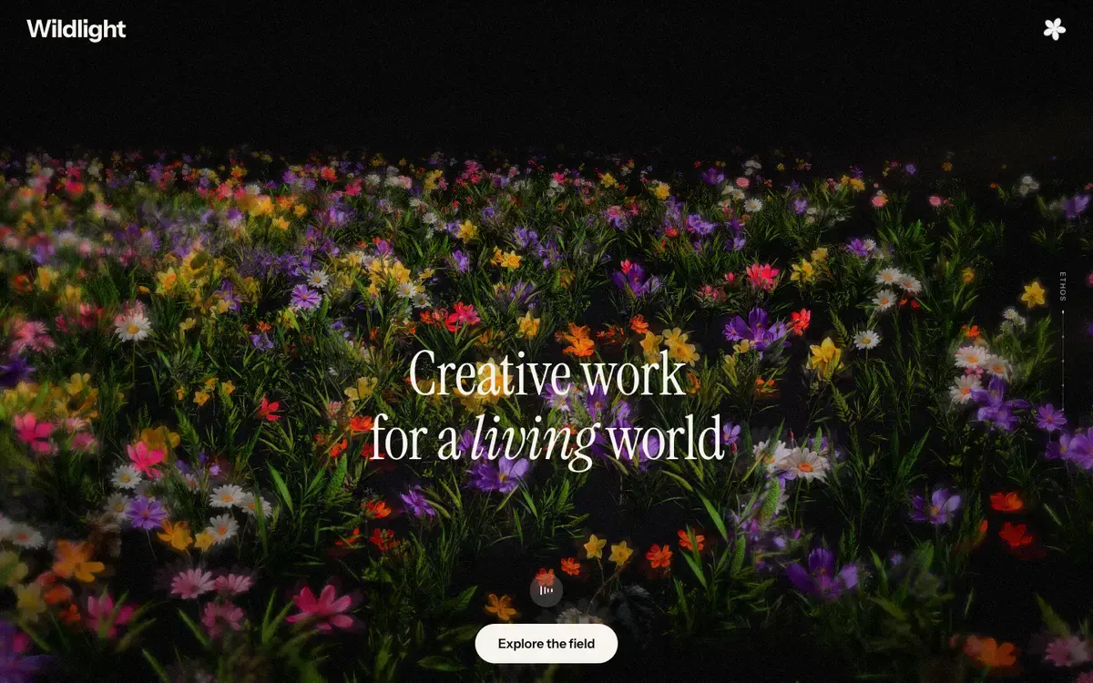
Wildlight
A meadow that plants itself, differently every time.